
Business Kick-Starter Guides
+1
How to Start a Dropshipping Clothing Business in 2025?
Being your own boss certainly brings aboard a multitude of benefits. Having the opportunity to grasp complete control over your...
14 Contact Us Page Examples for Your Dropshipping Clothing Store
Business Kick-Starter Guides

It takes a lot of patience and dedication to build a solid relationship with your target audience that will eventually transform them into loyal clientele.
Incorporating a ‘Contact Us’ page in your dropshipping fashion store should be the starting point of that journey.
With up to 86% of U.S. consumers voting as ‘very important’ having access to human customer service (Statista), it's clear that providing easy and direct communication channels is key to building trust and fostering long-term customer relationships.
In this article, we’ll explain what makes a great 'Contact Us' page and showcase inspirational 'Contact Us' page examples from successful online stores in the fashion industry that you’ll want to copy.
A ‘Contact Us’ page is a dedicated section on your website that allows visitors to get in touch with you.
It serves as a direct line of communication between your customers and your business, providing them with the means to reach out and connect with you.
A well-put-together ‘Contact Us’ page should have all the necessary information that your customers may need to contact you. Here are a few key elements to include:
Check out: How to create an ‘About Us’ page?
Don’t overwhelm your visitors with too much information or complex and confusing terminology.
Present the details you decide to include in clear and concise language so you can avoid causing misunderstandings among your customers.
Naturally, the design of your ‘Contact Us’ page should be visually appealing and consistent with the overall look and feel of your website.
However, you don’t want to make it look too cluttered, as this could detract from the page’s primary function and potentially confuse your visitors.
Stick to a simple layout to make sure your page is easy to navigate and understand.
A FAQ section can help address common inquiries and save both you and your customers valuable time.
Here, you can include questions that are most frequently asked by your customers and provide straightforward answers.
A ‘Contact Us’ page can also be an opportunity to showcase your commitment to customer service.
You can include testimonials or reviews from satisfied customers, demonstrating the positive experiences others have had when contacting your clothing dropshipping business.
This can help build trust and credibility and encourage customers to reach out and engage with you.
Cettire’s ‘Contact Us’ page is so effective because of its clean and organized layout.
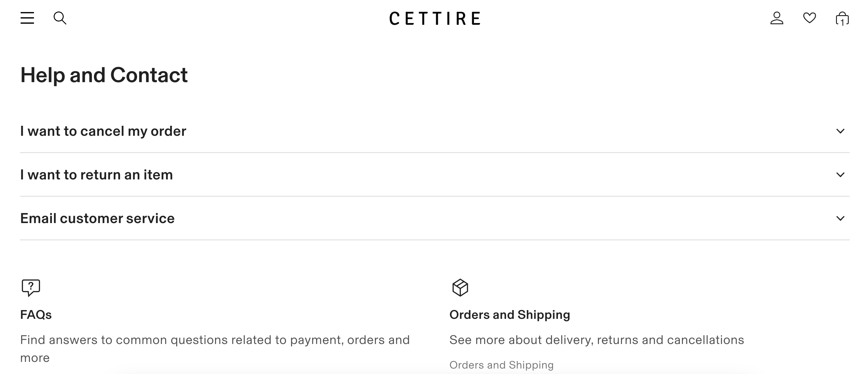
Why does it work?
Luisa Via Roma’s ‘Contact Us’ page stands out with its comprehensive range of contact options.
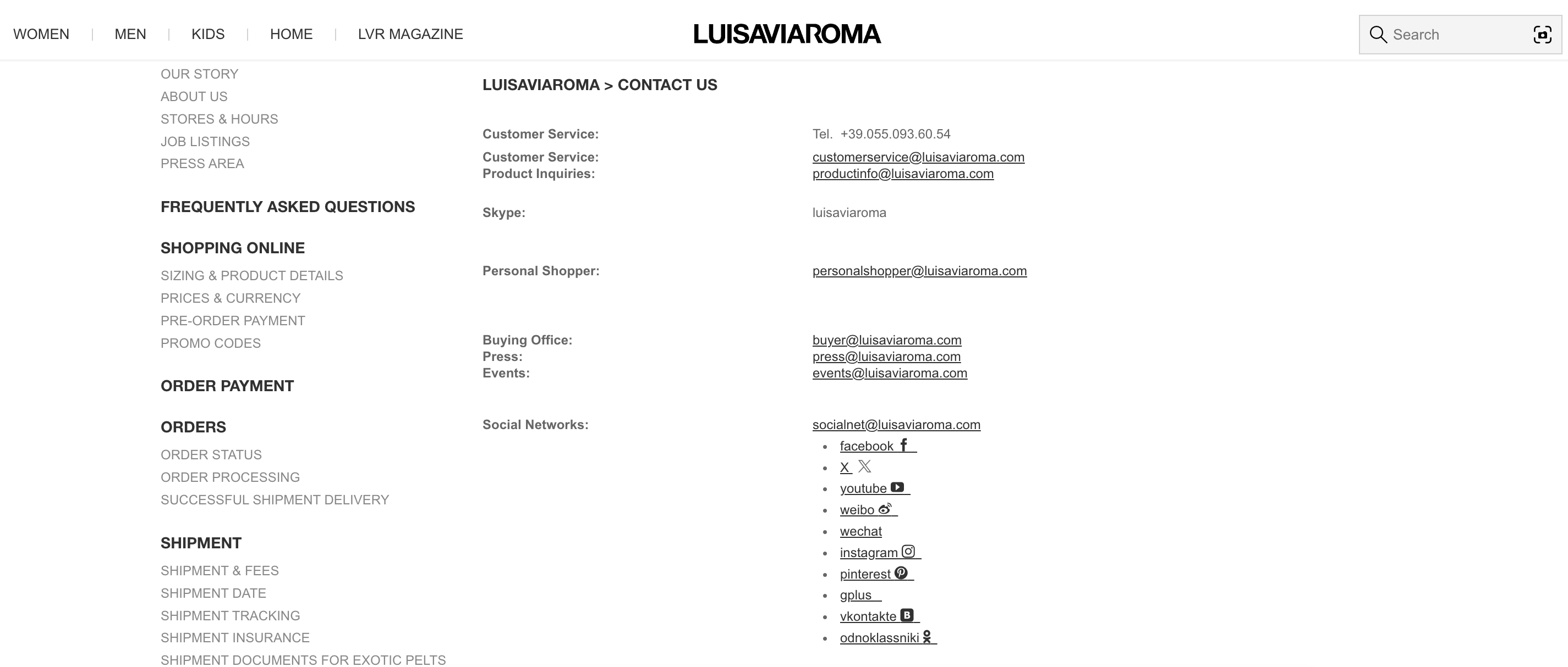
Why does it work?
Neiman Marcus’s ‘Contact Us’ impresses with its visually appealing design and helpful information.
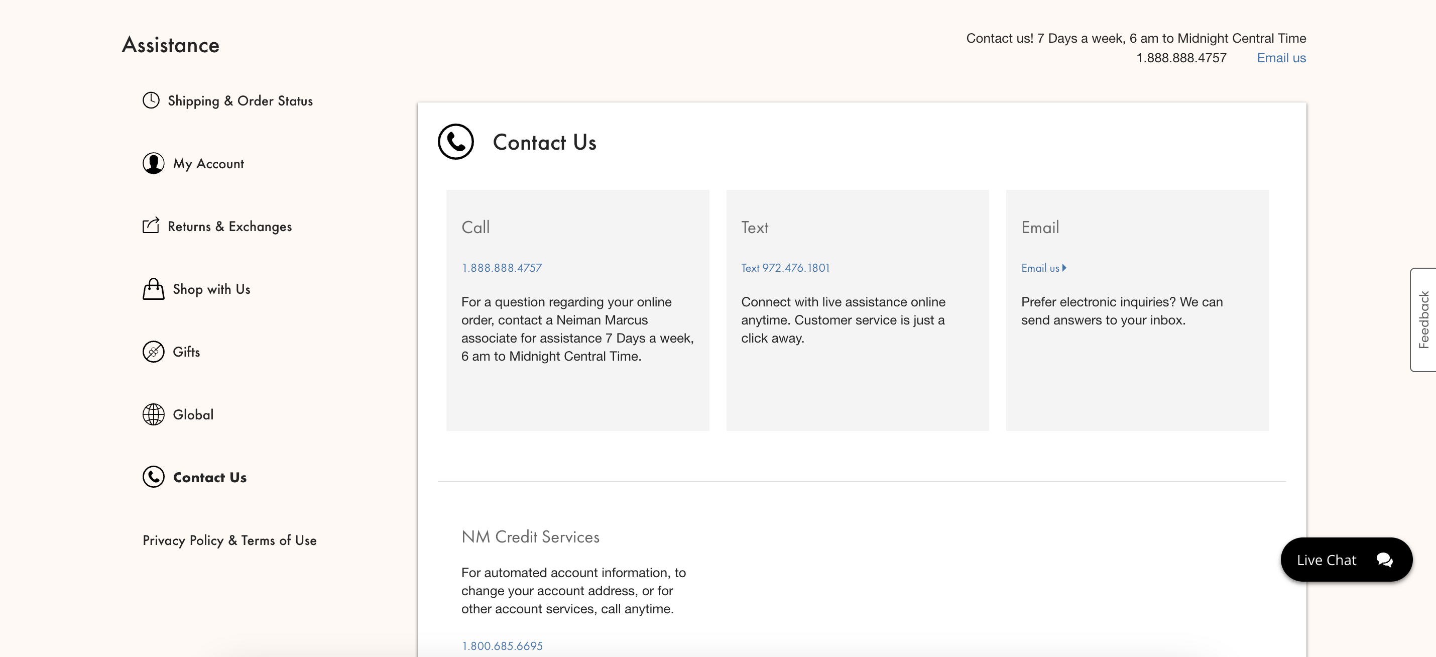
Why does it work?
Bluefly’s ‘Contact Us’ page keeps it simple and professional. They provide visitors with a contact page that is rich in text yet still quite easy to understand and find out the right contact customers are looking for.
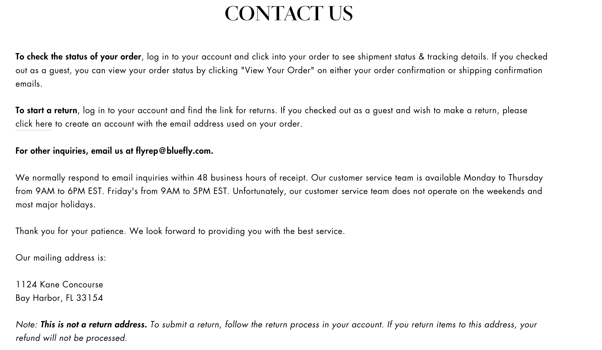
Why does it work?
The ‘Contact Us’ page of the fashion eCommerce store Vitkac is a great example of the type of layout and design that works best for such pages.
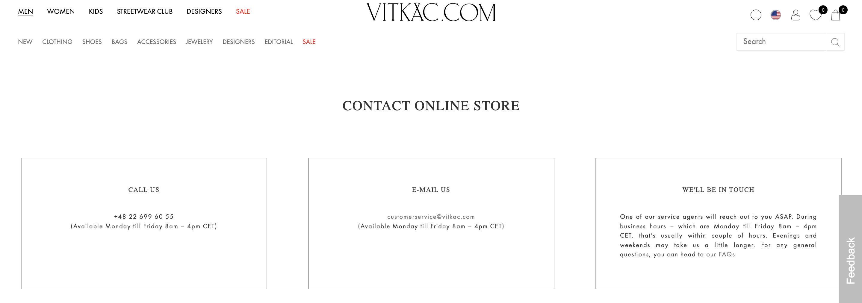
Why does it work?
Sometimes less is more and Azura Runway proves that by putting up a ‘Contact Us’ page that’s simple and free of any distractions.
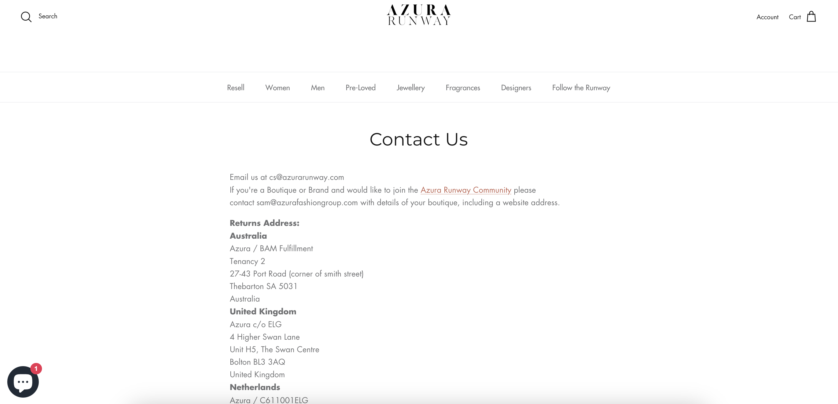
Why does it work?
Lyst is another online boutique with a simple ‘Contact Us’ page that provides customers with an easy and direct way to reach out for support, inquiries, or feedback.
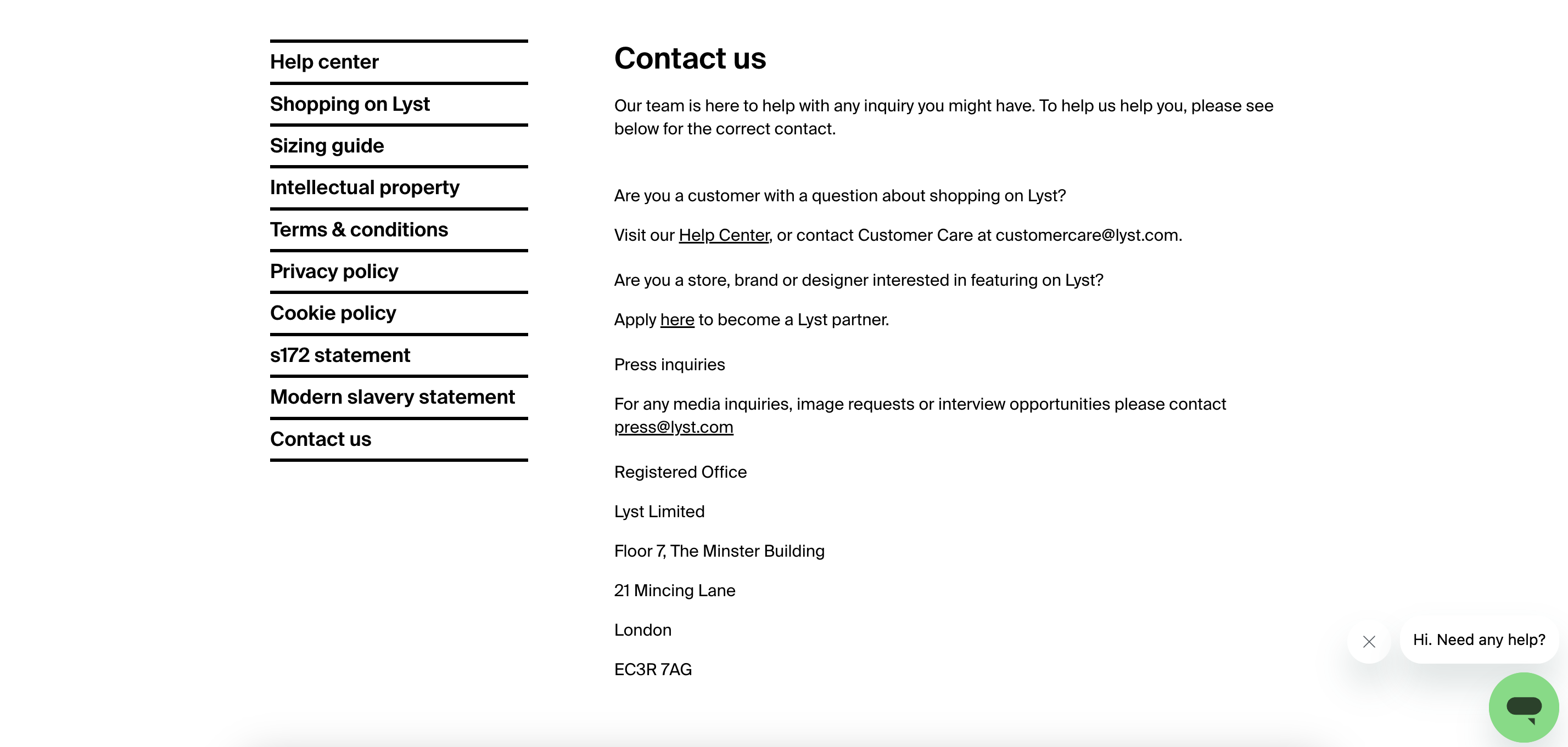
Why does it work?
Farfetch offers an easily accessible ‘Contact Us’ page that is also well-stocked with different kinds of contact details.
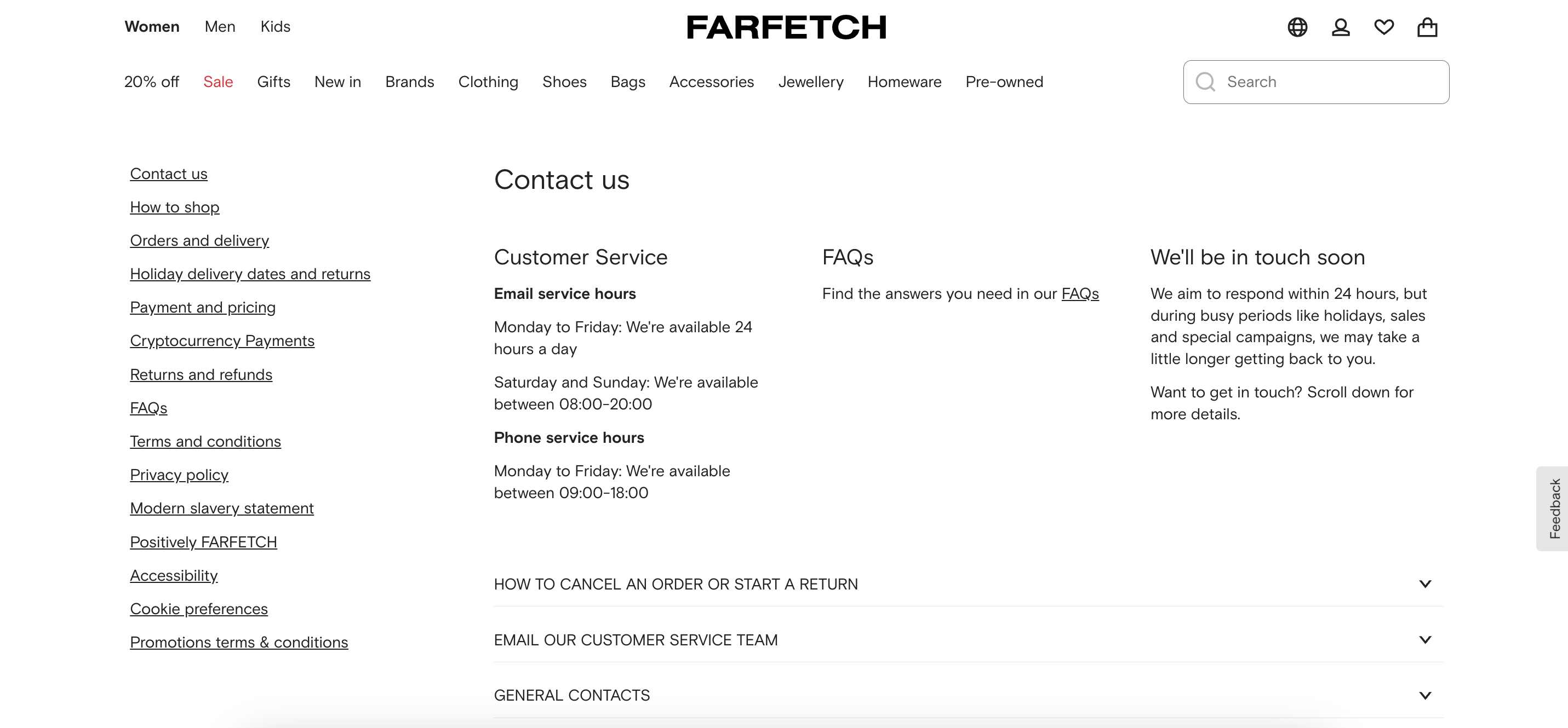
Why does it work?
Just like the rest of the pages of your clothing dropshipping store, your contact page should also have a good structure that can present your contacts in an orderly manner. Have a look at Mytheresa’s contact page, for instance.
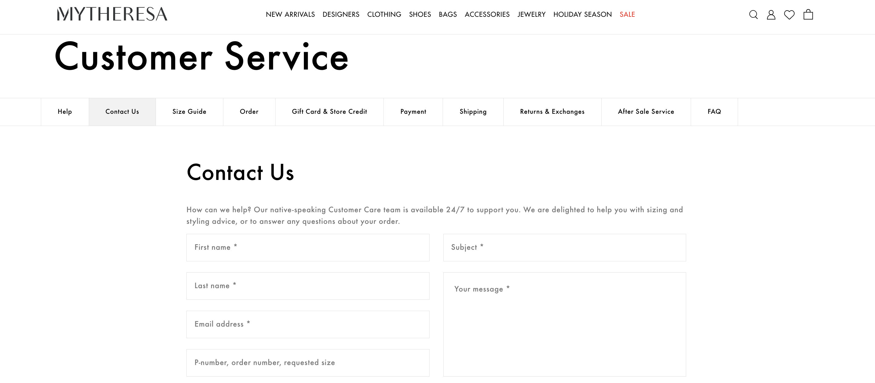
Why does it work?
Revolve have created a customer care page that every imperative information a customer would need when seeking support.
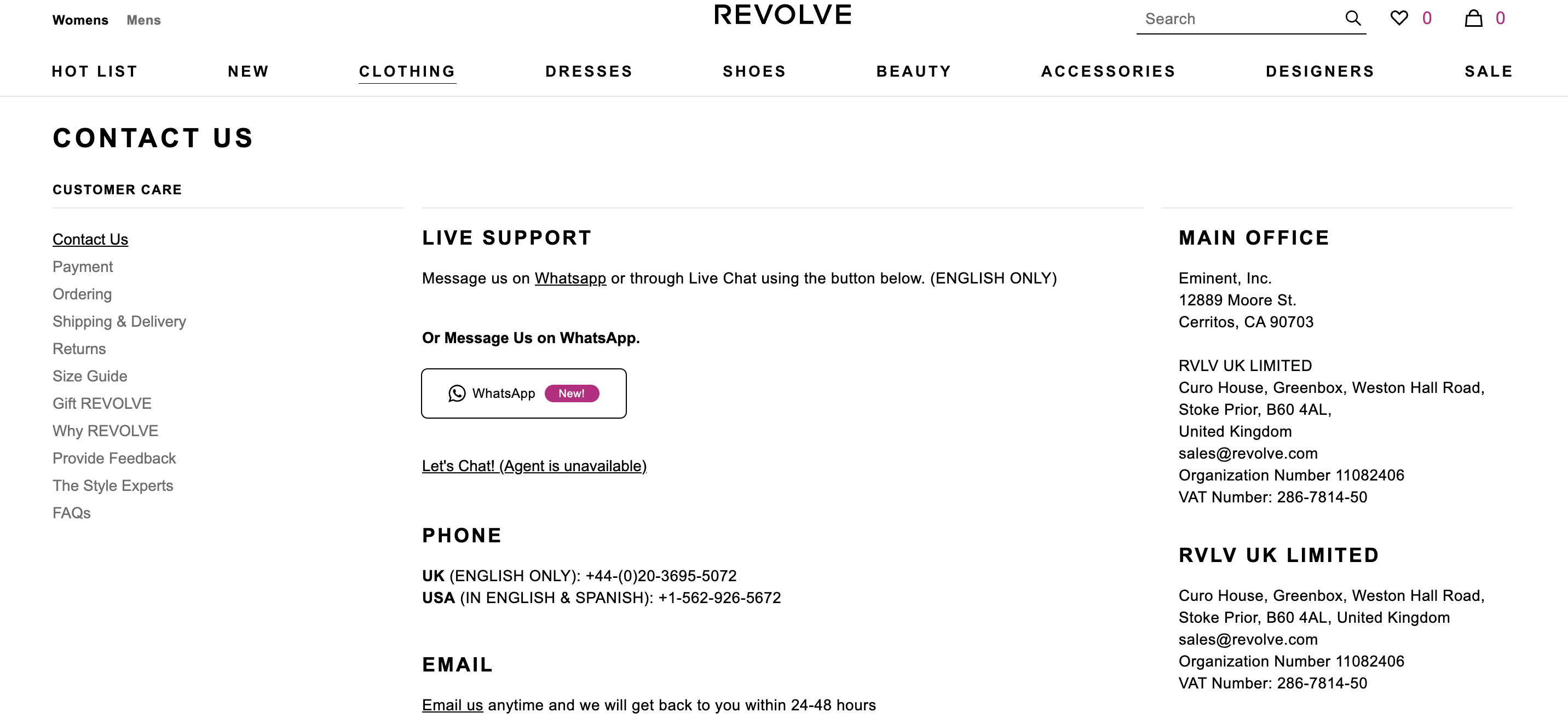
Why does it work?
What makes the contact page of SSENSE worthy of being an example is the fact that they don’t forget to mention important information that customers might frequently seek such as assistance in multiple languages or call fees.
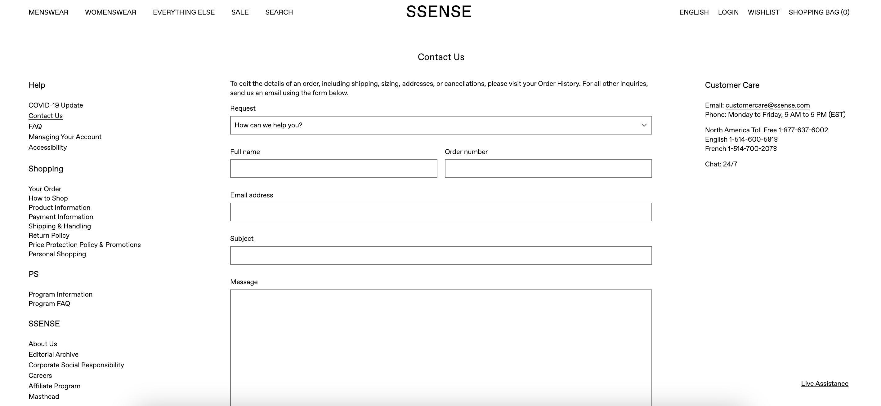
Why does it work?
If you find your page way too plain, why not insert an innovative element that will give it a zing to it? Take, Net-a-porter as an example.
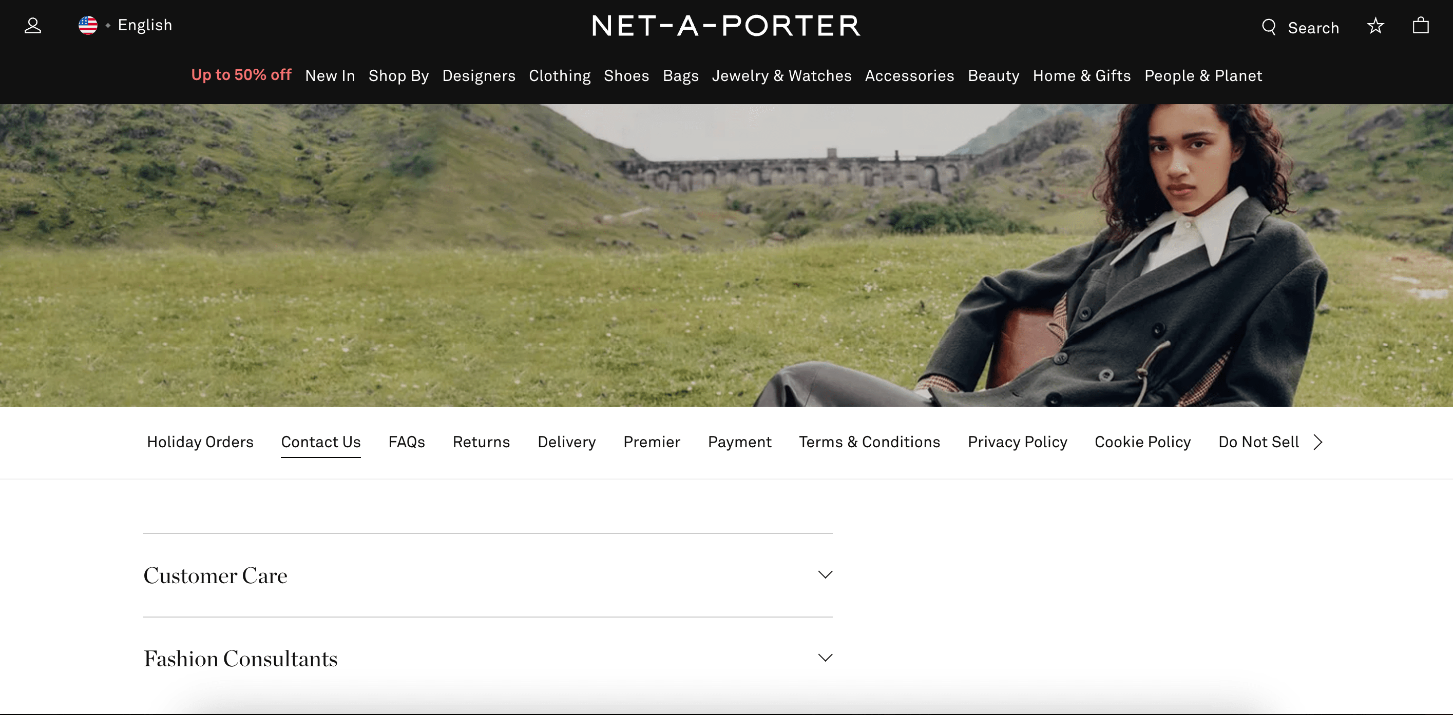
Why does it work?
In terms of design, it may seem way too simple, but Coltorti’s ‘Contact Us’ page effectively delivers all the information needed for customers to reach out for assistance.
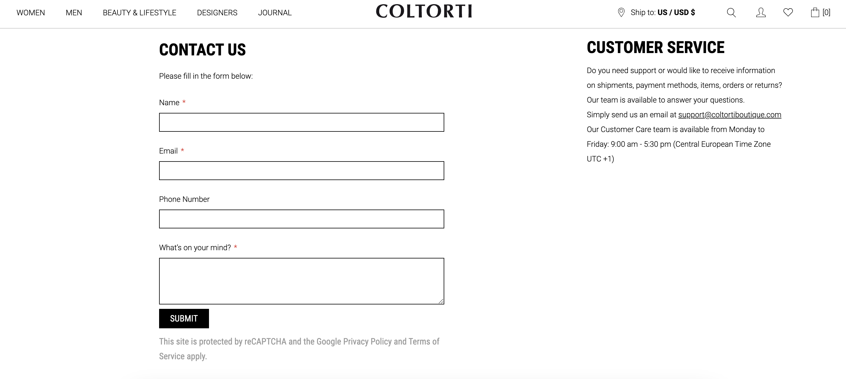
Why does it work?
At first glance, the ‘Contact Us’ page of FWRD might look like it has way too much than needed but, if closely examined, it reveals a well-arranged design that efficiently guides customers to the right resources and contact methods.
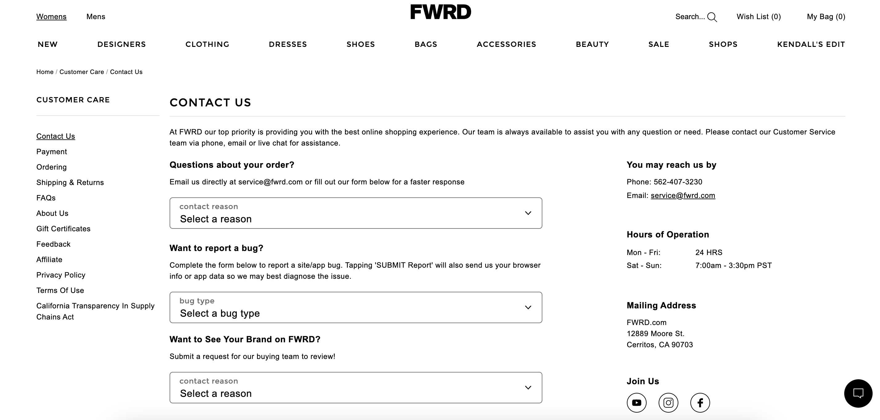
Why does it work?
Check out: Successful dropshipping fashion stores
The ‘Contact Us’ page is the place where your customers can reach out to you with their queries, concerns, or feedback.
This is a great way to promote your online clothing store as a reliable business that will support customers throughout their shopping journey with whatever help they need.
So, feel free to use these examples to build or optimize your ‘Contact Us’ page to perfection.
Remember, clear communication and excellent customer service are crucial for the success of your dropshipping fashion business!
The ‘Contact Us’ page is an essential element of every website as it serves as a channel of communication between you and your customers. The primary use of a ‘Contact Us’ page is to provide visitors with different kinds of contact forms that allow them to get in touch with your support team.
A ‘Contact Us’ page should always include an email address and phone number, and sometimes a physical address, social media profiles, and business hours.
What is dropshipping?