Converting FAQ Page Examples: How to build trust with your customers?
For dropshipping clothing stores, FAQ pages are especially important. They help bridge the gap between your business and customers by providing information that can resolve their concerns without having to contact customer support.
A study reports that close to 70% of customers would rather find an answer to their questions on their own by relying on the website’s resources - such as an FAQ section.
That being said, today, we'll look at some great FAQ page examples from different clothing stores to show you how these businesses have excelled in providing self-service to customers, and with that, have built trust with their audience.
Looking for a reliable dropshipping or wholesale supplier?
Join us today for top-quality products and unbeatable prices.
What is an FAQ page?
An FAQ page, short for Frequently Asked Questions, is a dedicated section on a website that addresses common inquiries associated with a business’s products or services.
These can range from product specifics, payment gateways, and shipping policies to after-sales service details and more.
Why is it important to have an FAQ page?
Creating an FAQ page for your dropshipping clothing store comes with multiple advantages that can significantly enhance your customers’ shopping experience and your store’s online visibility.
Here’s why an FAQ page is an essential feature for any dropshipping fashion store:
- Ease of access. Rather than sifting through pages or waiting for customer support responses, your visitors have immediate access to solutions.
- Customer support relief. By directing users toward the FAQ before reaching out to support teams, you can reduce the volume of repetitive inquiries that may overwhelm your service channels.
- Enhanced user experience. When customers find answers quickly and efficiently, their overall satisfaction with the site increases, fostering a positive user journey.
- Trust builder. Transparency through detailed FAQs can alleviate concerns or doubts, thereby enhancing customer trust in your brand.
- SEO benefits. By incorporating relevant keywords and providing in-depth answers to common questions, you create content that search engines like Google consider valuable. This not only helps your dropshipping store rank better but also increases the chances of appearing in featured snippets.
Check out: How to create ‘About Us’ page?
How to write an FAQ Page: 5 simple steps
Creating an effective FAQ page is quite an easy process which will break down into only 5 steps:
STEP 1: Identify the most common questions and concerns
Start by gathering the most frequent questions and concerns from your customers. This task can be achieved by analyzing customer support inquiries, social media comments, reviews, or any other medium where customers express their opinions.
STEP 2: Organize FAQs in a well-structured manner
After identifying the common questions, systematically organize them. Consider grouping similar questions together or categorizing them into different sections like ‘Shipping’, ‘Payment’, ‘Returns & Refunds’, etc., which allows users to find the information they seek effortlessly.
STEP 3: Write Clear and Concise Answers
Each answer should be clear, concise, and straightforward while providing all the necessary details to fully address the query. Be careful to avoid jargon or technical language. Instead, aim for simplicity and clarity in your answers.
STEP 4: Design
A well-designed FAQ page should be intuitive, visually appealing, and easy to navigate. Consider the following elements:
- User-friendly layout: Use a clean, organized layout that allows customers to easily skim through questions.
- Search functionality: Incorporate a search bar at the top of the FAQ page.
- Responsive design: Ensure your FAQ page is responsive and displays well on various devices, including smartphones and tablets.
- Expandable sections: If your FAQ page includes a large number of questions, use expandable sections or drop-down menus.
- Visual elements: Incorporate visual elements like icons, images, or videos where relevant. Use photo editing apps to enhance their quality. For instance, a short video explaining your return process can be more engaging than text alone.
- Easy-to-read fonts and colors: Choose fonts and colors that are easy on the eyes and align with your brand’s style.
- Call-to-Action (CTA) buttons: At the end of your FAQ page, include CTA buttons like ‘Contact Us’ or ‘Shop Now’ to guide users towards the next steps or back to your main site.
STEP 5: Regularly Update Your FAQ Page
Lastly, keep your FAQ page up-to-date by regularly reviewing and updating it as per your business changes and new queries arise. An outdated FAQ page can lead to confusion among customers and may even drive potential customers away.
Check out: Best ‘Contact Us’ page examples
What are some common FAQ questions to include?
Here are essential questions that customers frequently seek answers to:
- What sizes are available for your clothing items?
- Are there any currently available discounts or promotions?
- How can I track the status of my order?
- Do you ship internationally?
- What are the shipping costs and delivery times?
- What payment methods do you accept?
- What is your return and refund policy?
- How can I leave feedback or a review for a product?
- How can I sign up for your loyalty program?
- How do I contact customer service?
- What are your customer service hours?
- How do you handle my personal data and privacy?
- How do I create an account?
Check out: Questions to ask your dropshipping supplier
Best FAQ page examples of clothing stores
Farfetch
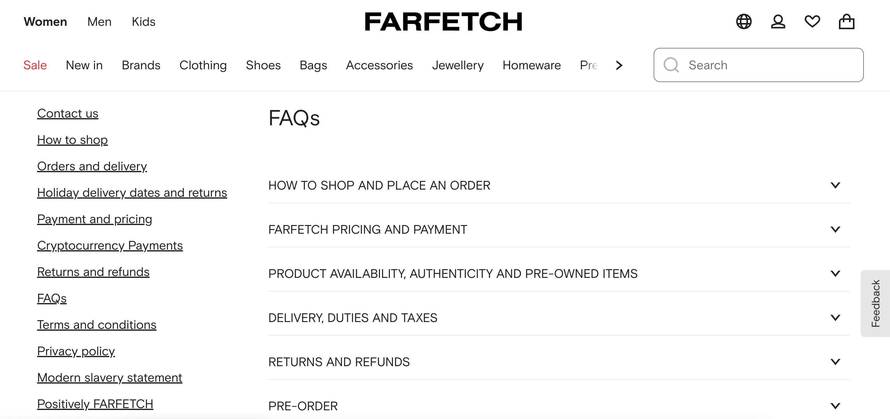
Farfetch has an FAQ page that reflects the store’s commitment to customer service excellence.
Why does it work?
- Simple design and clean layout.
- Questions are neatly organized in multiple sections.
- Users can quickly navigate through sections such as Farfetch Pricing and Payment, Returns and Refunds, ‘Promotions,’ ‘Size and Fit’ and ‘How to Shop and Place an Order’.
- A prominent search bar at the top of the page allows customers to enter specific queries, guiding them to relevant answers effortlessly.
Intermix
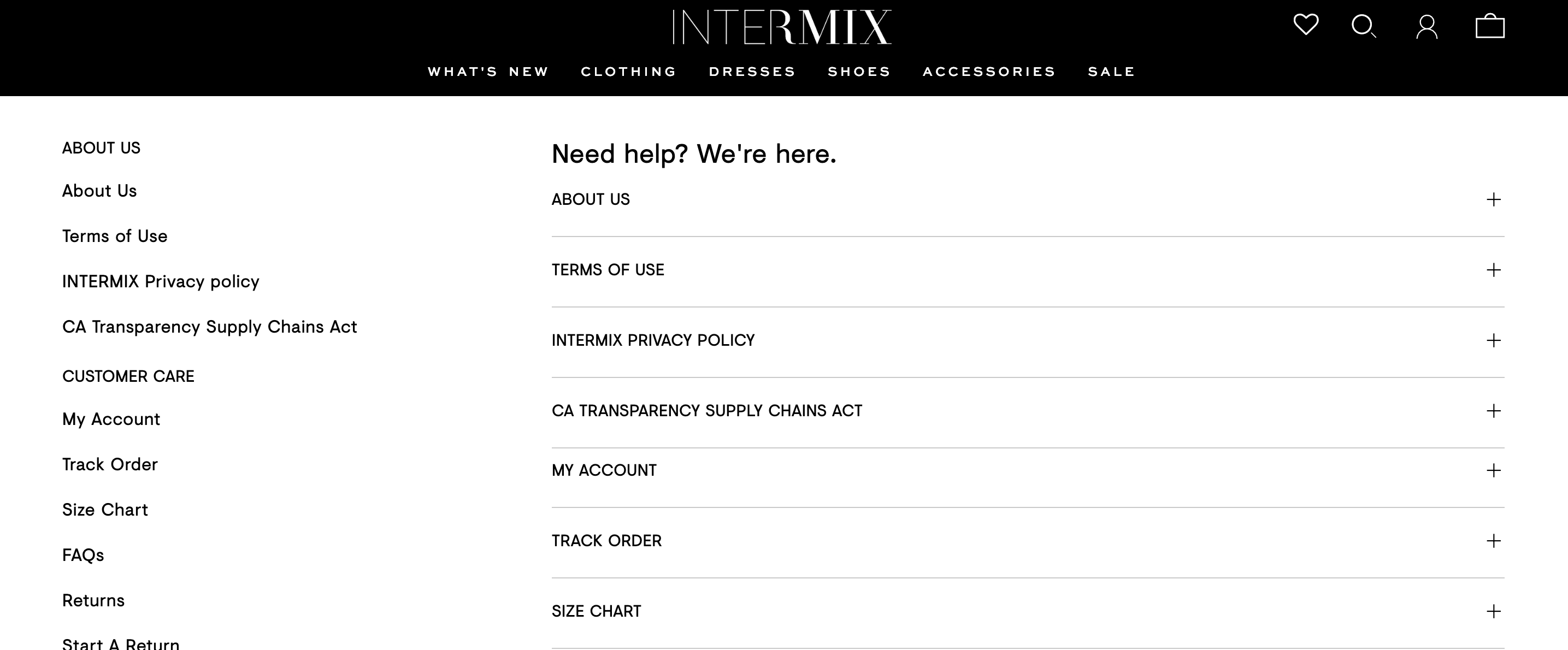
Intermix’s FAQ page reflects a customer-centric approach, providing immediate access to essential information while enhancing user experience on their site.
Why does it work?
- Each question on Farfetch’s FAQ page is addressed with a precise yet thorough response, ensuring customers have a clear understanding of policies and procedures.
- For queries not resolved by the FAQ, Intermix presents clear contact options, encouraging customers to reach out via multiple channels such as phone or email.
Jason Wu
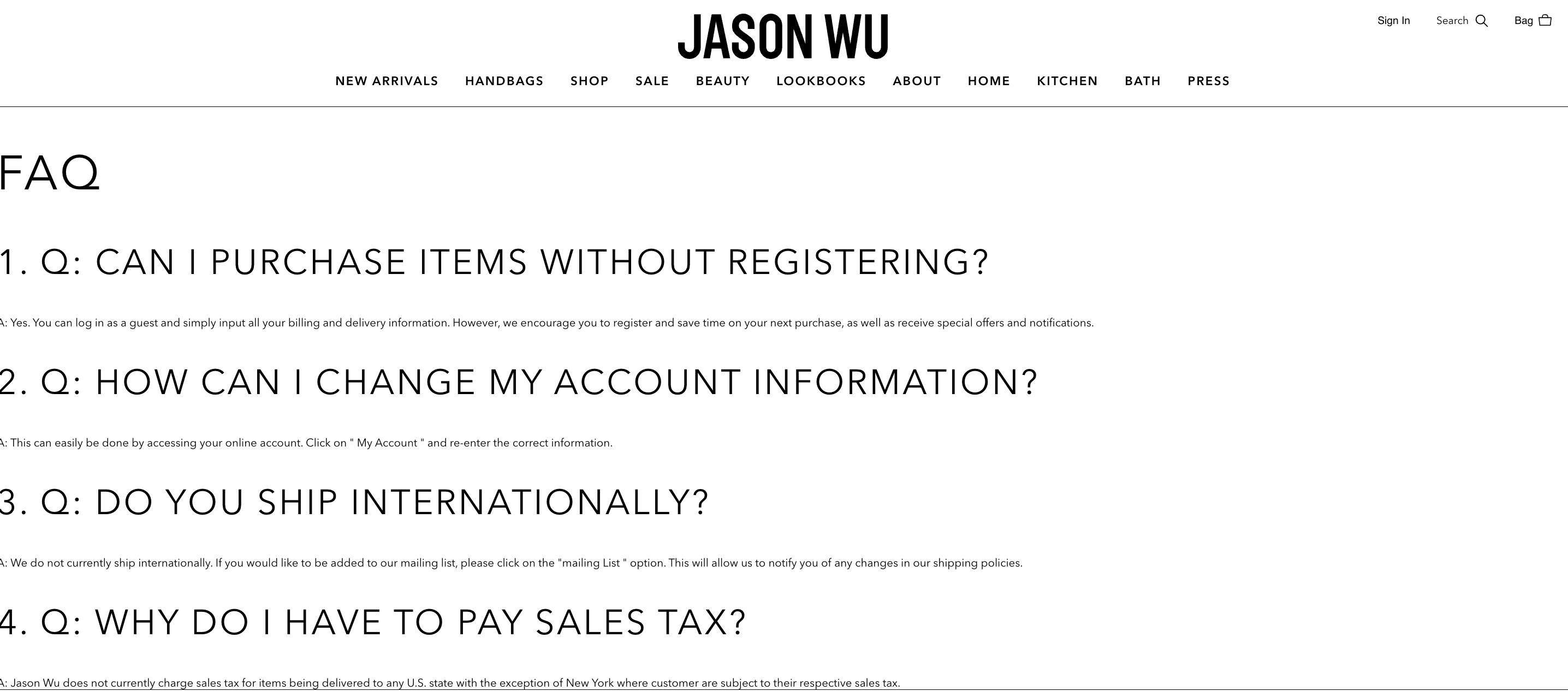
Jason Wu’s FAQ page exemplifies how simplicity and clear communication can result in an effective resource for customer queries.
Why does it work?
- It covers a broad range of topics, from product inquiries to shipping and return policies.
- Each question and answer is written in straightforward language, making it accessible to a wide array of customers.
Fashionphile
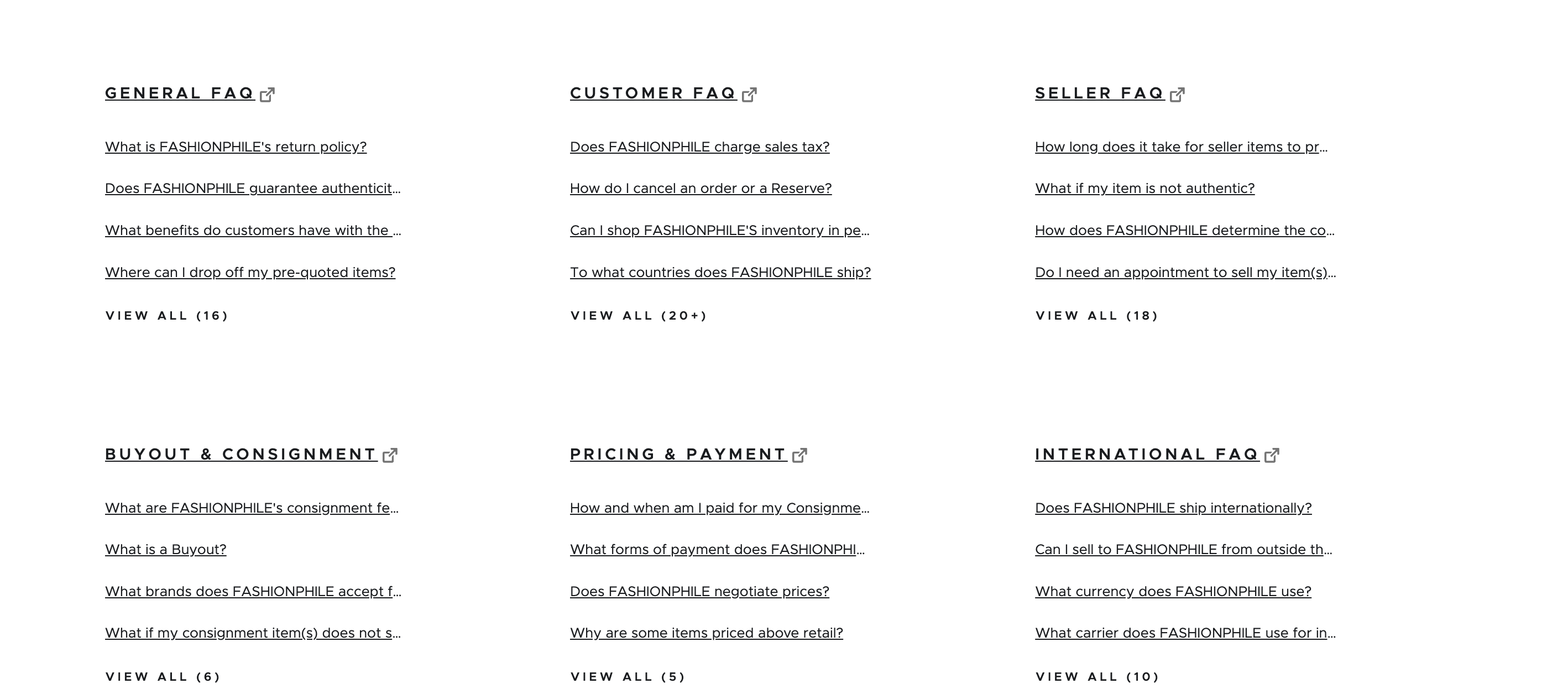
Through their dedication to educating customers and being transparent about their processes, Fashionphile’s FAQ page goes above and beyond to deliver an exceptional user experience.
Why does it work?
- The layout is clean and organized, with different categories such as ‘General FAQ,’ ‘Customer FAQ,’ ‘Seller FAQ,’ ‘International FAQ,’ and many more.
- For those who prefer finding answers on their own, Fashionphile’s FAQ page offers a convenient search bar at the top.
- Despite providing comprehensive answers to common questions, Fashionphile still includes contact information at the very top of the page.
Saks Fifth Avenue
The Saks Fifth Avenue’s FAQ page is a great FAQ page example of how to create an FAQ section for a dropshipping store that sells luxury fashion brands.
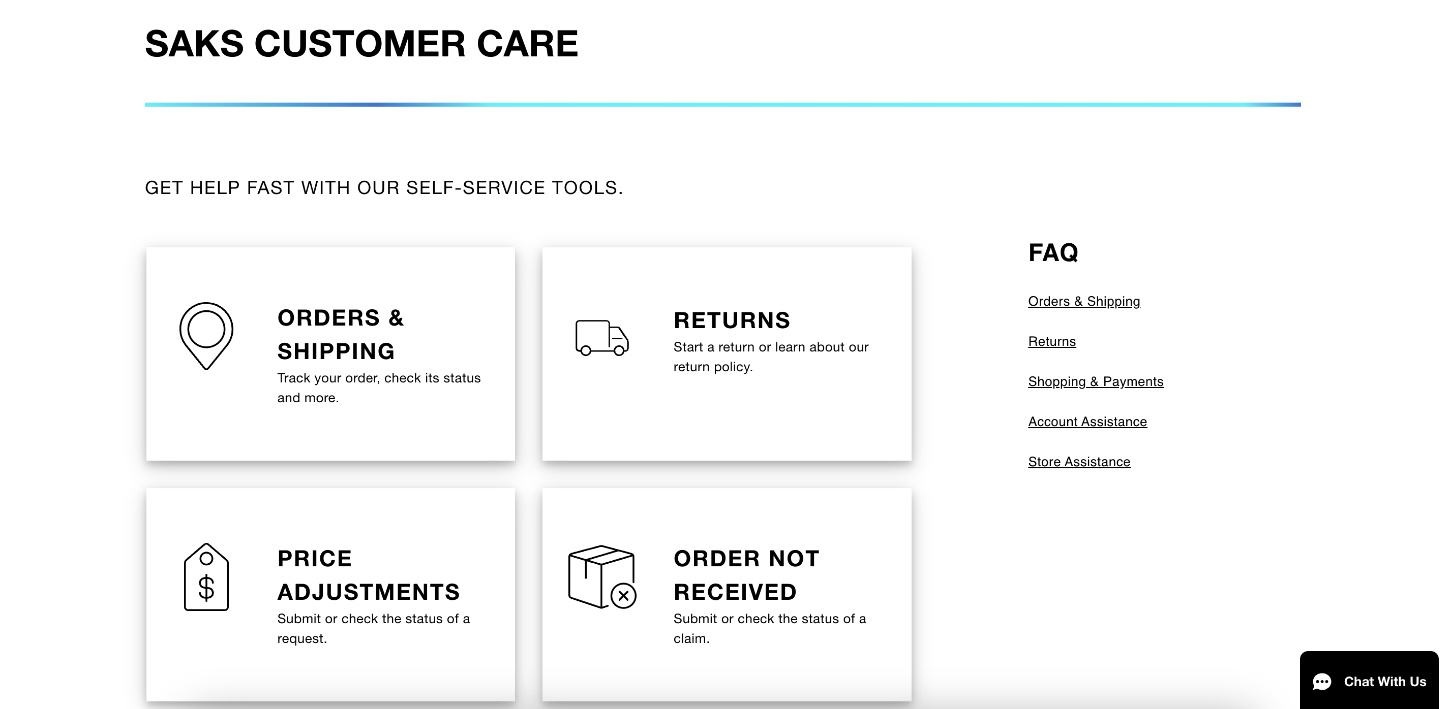
Why does it work?
- The page is divided into different categories, making it easy for customers to find the information they need quickly.
- Categories like ‘Orders and Shipping.’ ‘Returns,’ ‘Account Assistance,’ and ‘Shopping and Payments’ direct users to the relevant answers.
- Answers include links to related pages, providing quick access to further information.
Check out:
Moda Operandi
Moda Operandi’s FAQ page upholds its reputation by presenting an elegant and detailed resource for customers.
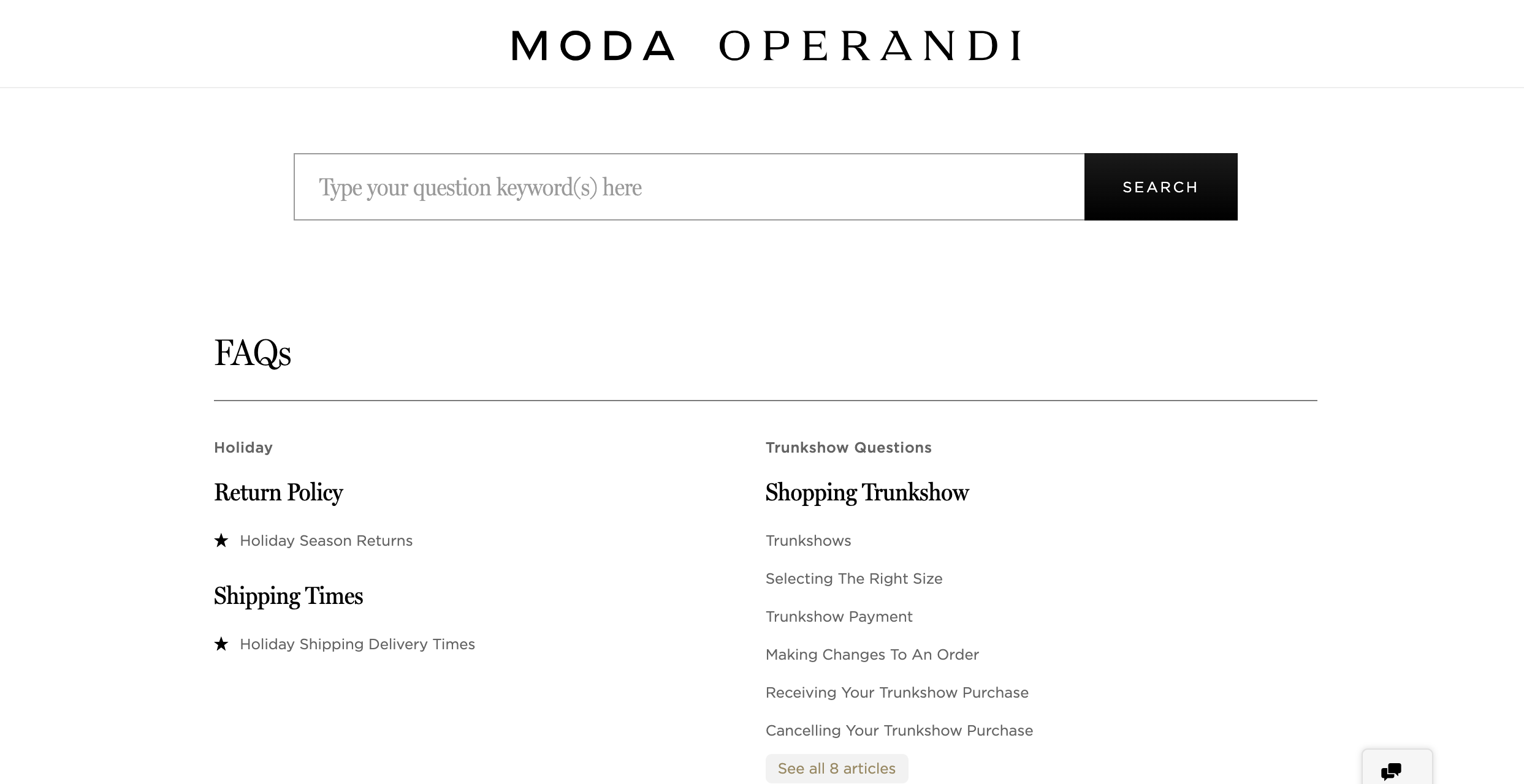
Why does it work?
- Minimalist design with plenty of white space that puts focus on the text, making it easy for users to read and understand the information.
- The FAQ sections are divided into plenty of categories that cover different issues,
Rebag
The key takeaway from Rebag’s FAQ page is its excellent organization and attention to detail, which ensures every customer query is addressed effectively.
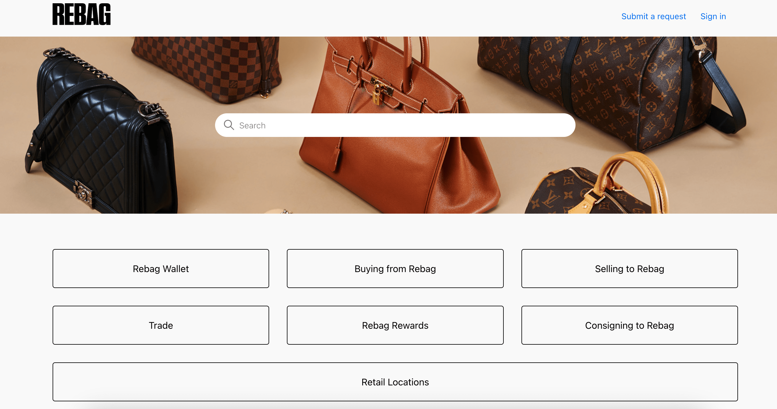
Why does it work?
- FAQ topics are presented in a creative design in the form of clickable buttons.
- The most common questions out of all categories are linked right below the buttons.
- Each question is linked to a separate page that offers an in-depth explanation.
24S
When you visit the FAQ page of 24S, you’re immediately greeted by a sleek design that guides visitors effortlessly to the information they are looking for.
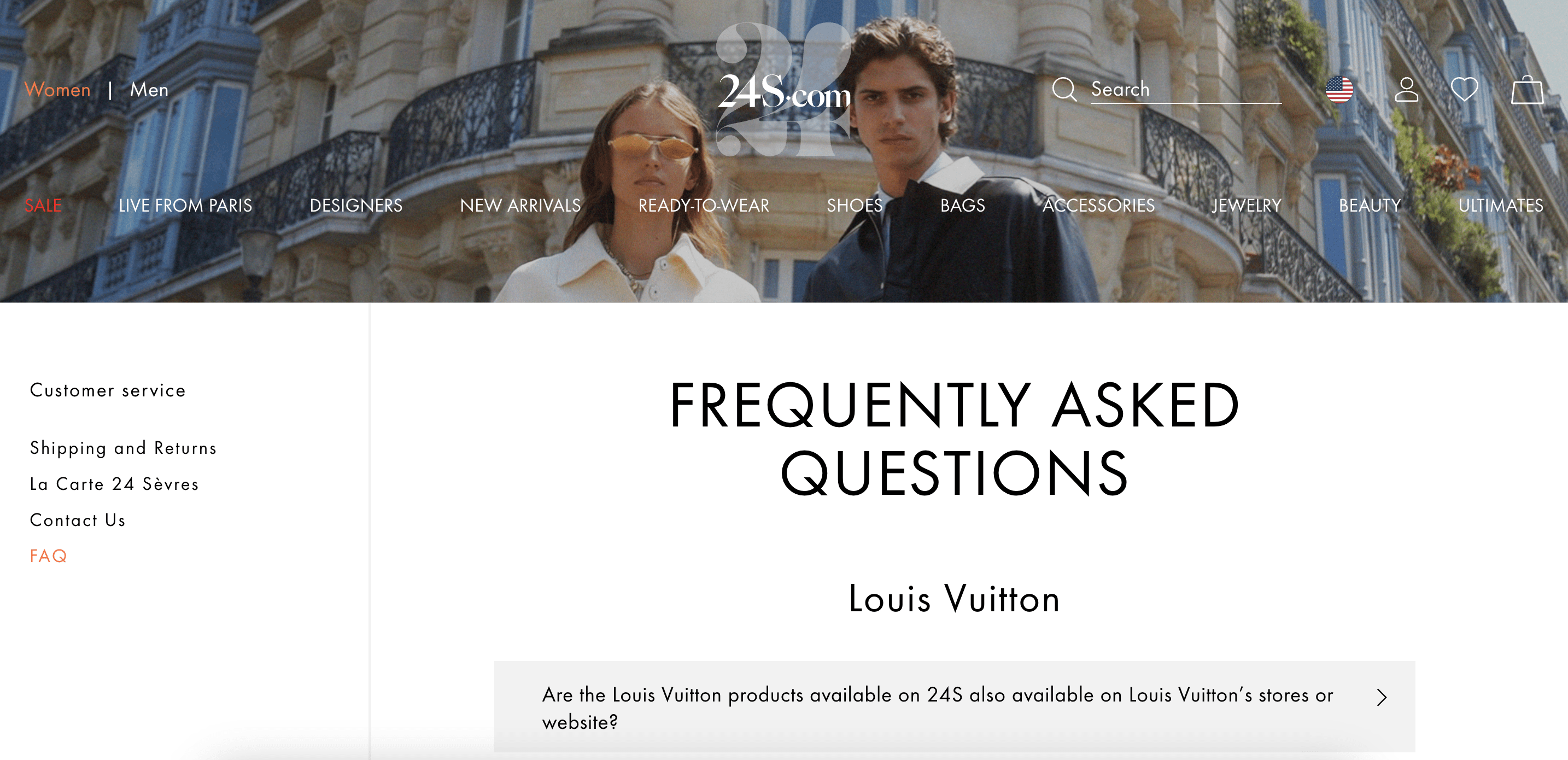
Why does it work?
- The FAQ page uses a drop-down format for each question, making it easy for customers to navigate directly to the information they need.
- Recognizing their global audience, 24S offers their FAQ content in both English and French.
Check out: ChatGPT for customer support
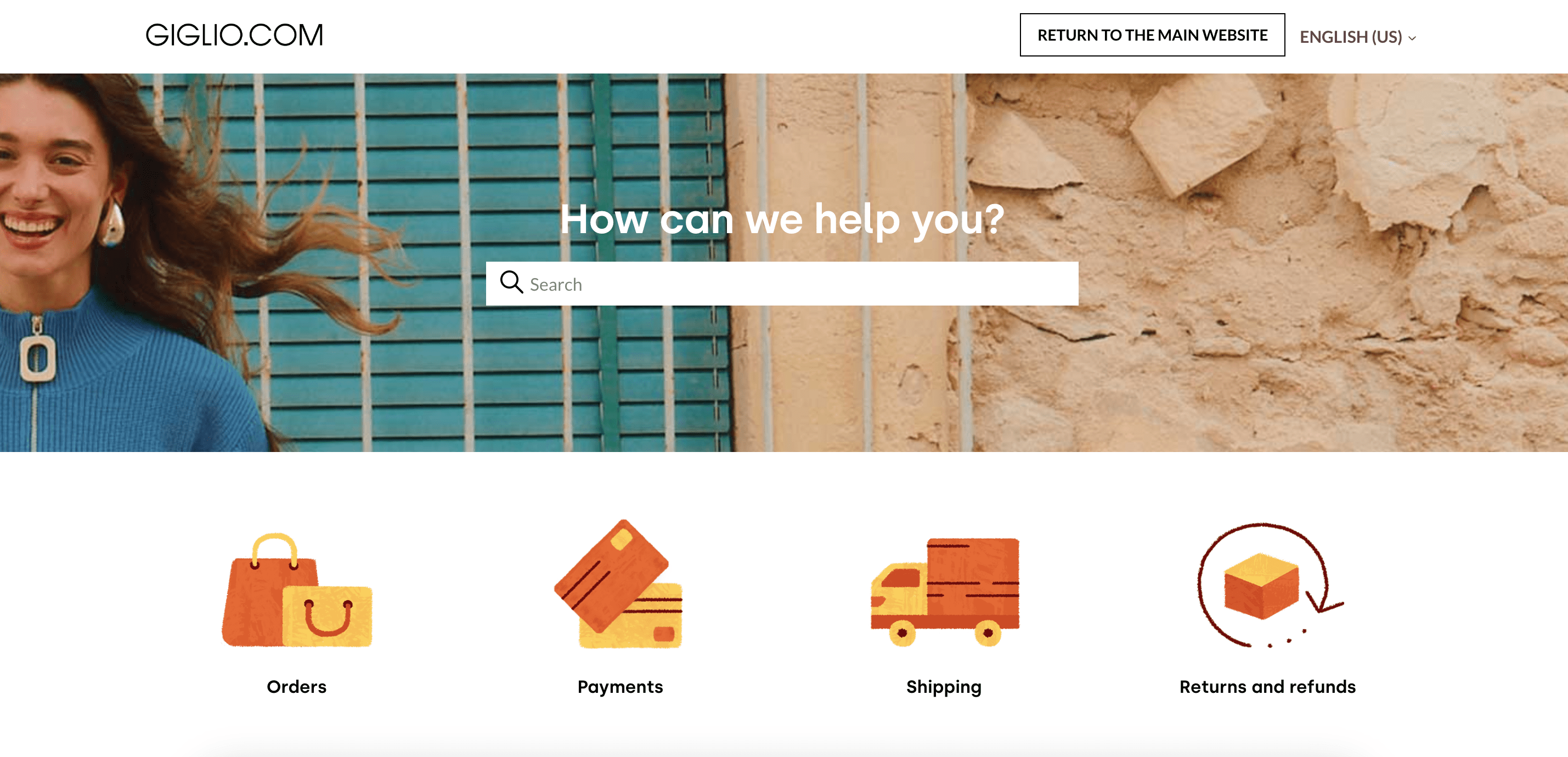
Giglio
By integrating comprehensive information with an intuitive layout and additional features for enhanced user experience, Giglio shows how an FAQ page can be both informative and reflective of a brand’s image.
Why does it work?
- Upon landing on their FAQ page, you are greeted with a clean layout that is easy to navigate.
- Each answer provides not just precise information but also links to related topics.
- Giglio incorporates visual aids where needed as well. For example, to better explain the payment methods they offer, they use a table to present all the types of credit cards and payment gateways they are willing to accept.
Tootsies
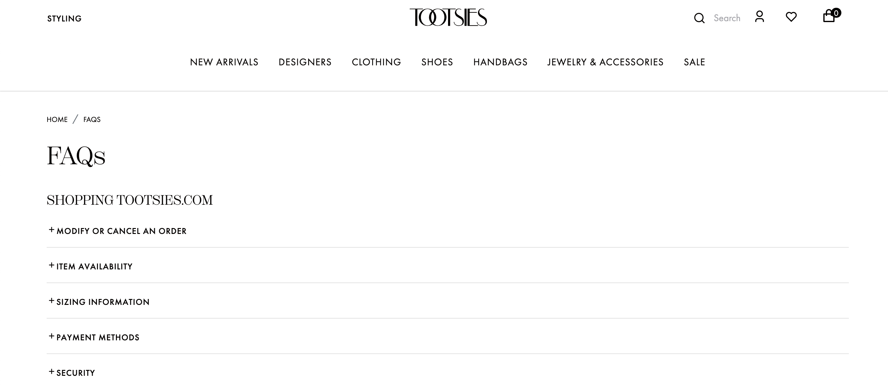
Another FAQ page example can be seen on Tootsies’s website, standing out with its elegant design and focus on customer needs.
Why does it work?
- Their FAQ page covers a wide range of topics.
- All questions are answered with short, simple, and straightforward answers.
- If customers aren’t able to find what they need, contact information is provided at the end of the page.
What Goes Around Comes Around
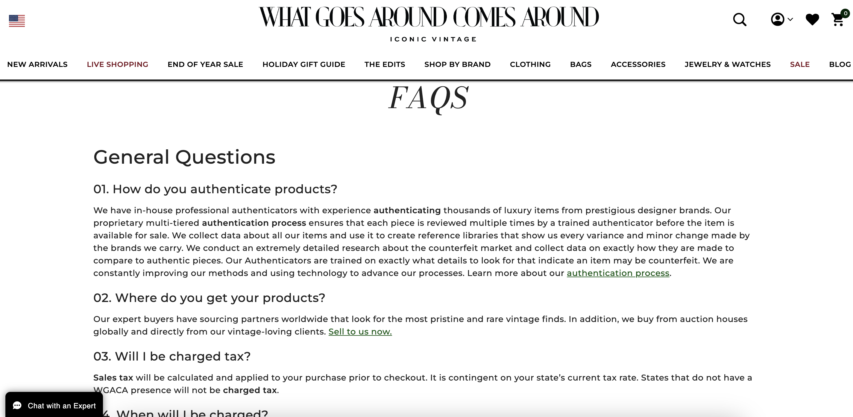
The What Goes Around Comes Around FAQ page effectively builds trust while providing an excellent user experience, serving as a significant asset in their customer service strategy.
Why does it work?
- Rich FAQ page that provides a mix of short and longer answers depending on the question.
- Questions are grouped into multiple categories depending on the topics they cover.
Build trust with your customers
Crafting an FAQ page that answers the most common questions your customers are asking is a key step in building up your dropshipping clothing business as a trusted business.
By taking inspiration from the FAQ page examples provided, you can design an FAQ page that not only serves as an information hub but also enhances your customers’ shopping experiences.
Remember, an effective FAQ page should be easy to navigate around, has a user-friendly design, and addresses common concerns by providing simple answers.
Don’t forget to keep on updating your FAQ page by regularly engaging with your customers and staying informed about the latest questions they need an answers to.
FAQ
-
An FAQ (Frequently Asked Questions) page should contain a comprehensive list of questions and answers that address common customer inquiries and concerns.
For a dropshipping clothing store, these might include:
- Product information: Details about sizes, materials, and fit.
- Shipping: Information on shipping times, costs, carriers, and tracking.
- Returns: Guidelines on how to return or exchange items.
- Ordering process: Steps on how to place an order, payment options, order modification, and cancellation policies.
- Customer support: How customers can get further assistance.
- Security and privacy policies: Information on how customer data is protected and used.
- Loyalty programs and discounts: Details on any loyalty programs, promotions, or discounts available.
-
FAQ answers should be simple and short, typically ranging from a few sentences to a short paragraph. The goal is to provide clear, straightforward answers that resolve the customer’s query without overwhelming them with information. Ideally, each answer should be around 50-150 words, depending on the complexity of the question.
-
While traditionally FAQs are formatted as questions and answers, they don’t always have to be strictly phrased as questions. The focus should be on addressing common customer concerns and topics.
Related articles
Our clients' success stories speak volumes about the impact BrandsGateway has had on their businesses.
View More Articles